GUI guidelines
Principles
The following principles describe concepts that help drive GUI development. They are also designed to avoid common issues.
Note
The following principles are recommendations only, it is at your discretion whether or not to use and implement these guidelines.
For the purpose of this document, and to avoid confusion, the following terms will be defined:
- Modal
A modal window is a graphical control element subordinate to an application’s main window.
- Workflow
A workflow that describes the steps to complete an action.
Design to scale
Your designs should reflect production environments rather than development environments. For example, a production environment can have fifty images rather than the three included in devstack. Using a control that is appropriate for three images can impact the usability associated with production environments.
For example:
Instances: 2,000
Images: 50
Projects: 2,000
Users: 1,000
Operators: 8
Regions: 8
Use cases
Open source developer-driven projects do not always consider the end user when creating products. Educating and helping novices to complete a resource is vital. There are two assumptions within the community:
Novices users require a GUI
Advanced users use a CLI or API
Ensure workflows provide enough information for users to drive the decision- making process. We recommend referring to the OpenStack personas when designing and creating. The personas are:
Specific use case interfaces vary based on the individual use case. For example, a GUI may be appropriate to launch 1-x of the same instance, but difficult for multiple instances that are different.
See OpenStack personas for more information.
Mandatory parameters
Mandatory parameters are the minimum parameters required to create a resource. This is especially important for complex nested resources, like load balancers or networks. Mandatory parameters allow users to create resources without being intimidated by a significant number of steps. We suggest creating the top level resource and then send the user to the network details page.
The 80% rule is a software framework that ensures 80% of use cases are easy to implement, and 20% of use cases are difficult to implement. We recommend using mandatory parameters to encourage designers and developers to keep to the 80% rule when creating a workflow.
Note
Using mandatory parameters assumes that users are able to add parameters in the resource.
Patterns
The following patterns provide GUI frameworks to assist designers and engineers to create interfaces that are consistent across OpenStack products.
For example, the horizon project chooses to use bootstrap.
See Styling in Horizon (SCSS)
for more information.
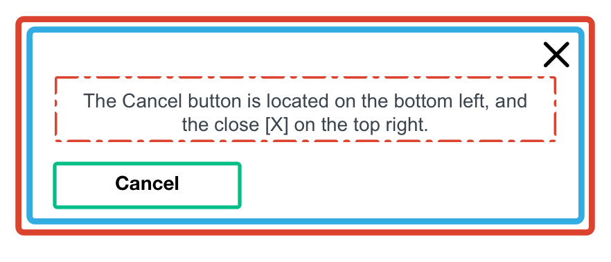
Cancel buttons
On modals, the cancel button should be located at the bottom left and
the X to close should be located at the top right.
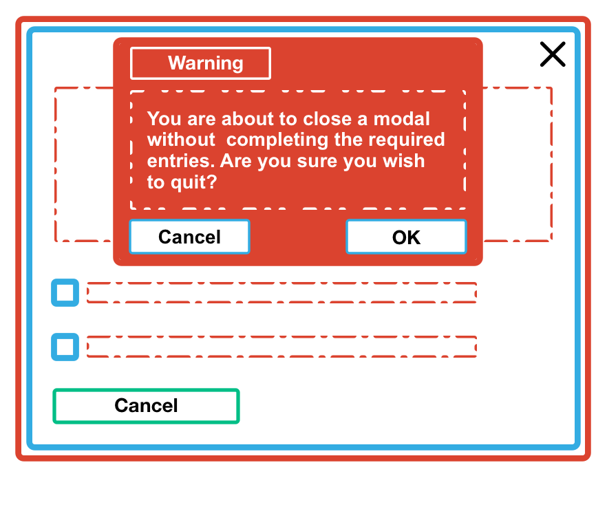
Modal error messages
When canceling a modal that has forms that are partially completed, we recommend a warning should be displayed at the top center of the modal.
Note
Any error message displayed should be inside the corresponding modal to avoid GUI conflicts.
A red background and a warning icon on the top left are also recommended.
For more information on guidelines for UI text, see UI text guidelines.
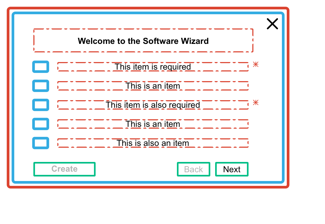
Wizards
A software wizard presents a workflow and helps users through it. The
Back and Next buttons should be located at the bottom and to the
right of the modal, but to the left of the create button. The Back
button should be disabled, instead of invisible. Initially, the Create
button should remain disabled until the mandatory parameters have been
provided. All required items should have an asterisk on the right.
Page errors
Any error messages should be displayed on the upper right corner of the
browser. A counter should be displayed for error messages that persist for
a certain number of seconds. All error messages should close by pressing
the X on the upper right corner of the message.
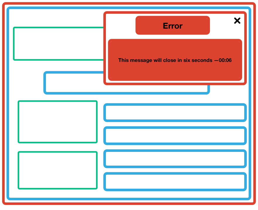
Note
The error message height should vary to fit the content.
For more information on guidelines for UI text, see UI text guidelines.
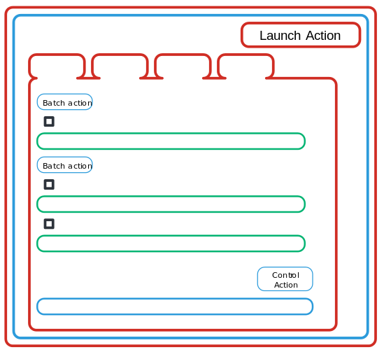
Actions
Global actions should align to the top right and be placed on the top
of the table. For example, the Launch Instance button is a global
table action.
Batch actions, which apply to single or multiple rows, should align to the left and be above the rows’ checkboxes.
Control actions should align to the right of the row. In addition, checkboxes should align to the left of each row and be used for deleting single or multiple rows.
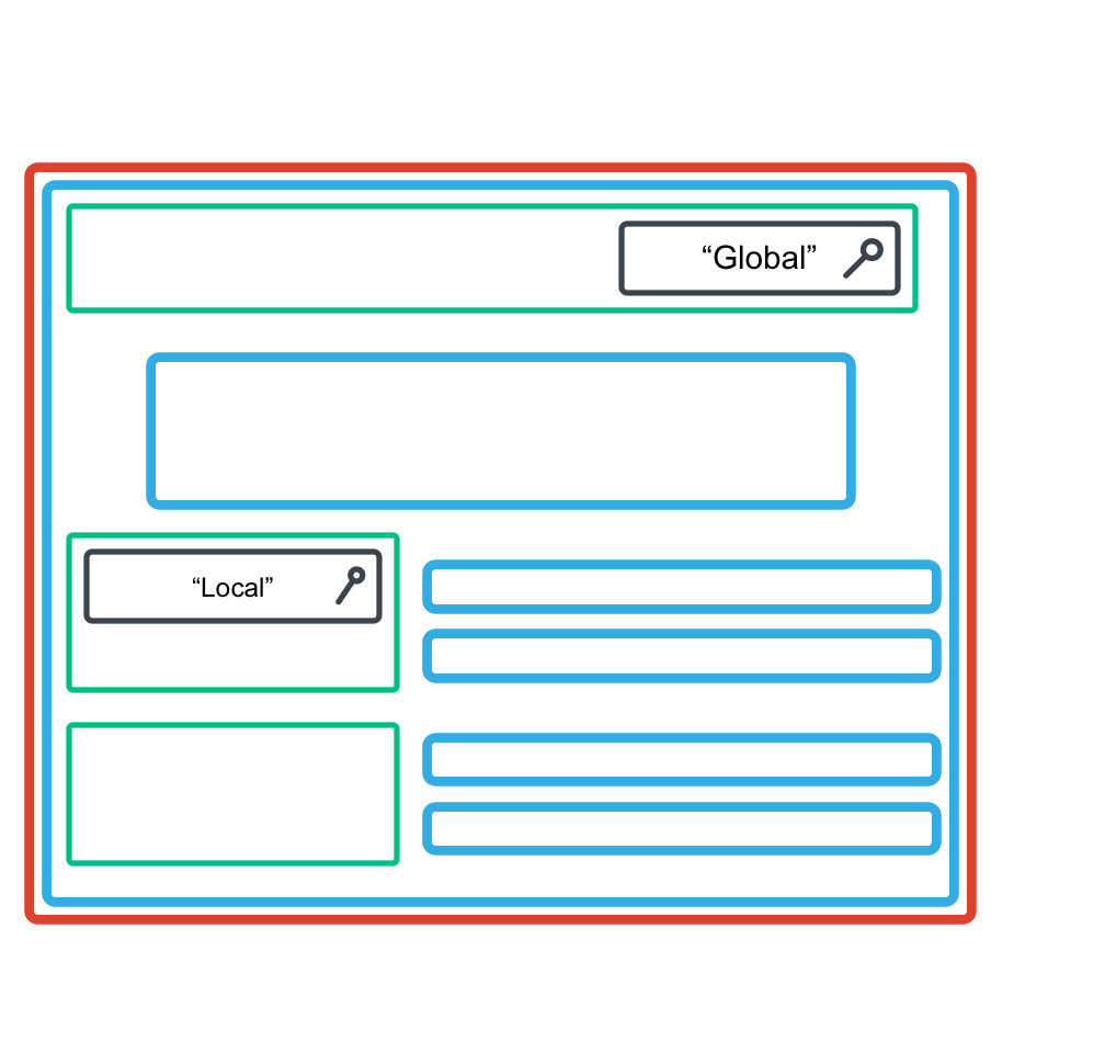
Search
There are typically two search box types within GUIs. There is the global search, which applies to all pages, and local (panel) search box, which searches within pages. We recommend global search boxes be located in the masthead, and the local (panel) search be located within the page.
Note
Using the search boxes interchangeably can cause confusion as it is not always clear what is being searched.
Icons
We recommend using the following icons from Font Awesome with the corresponding meaning.
- Create
The create icon is used for global actions, such as launch instance or create volume. No other icons, such as ‘upload to cloud’, should be used with global actions.
- Delete
The delete button should be used with any destructive actions including, global, batch, and control actions.
- Warning
Use the warning icon to ensure the user is aware that data will be lost if they proceed with an action. For example, canceling out of a modal even if the user has completed some of the forms. In addition, it should indicate that a resource is unusable. For example, use the warning icon to indicate that a flavor cannot be used because all available quota for a project has been consumed.
- Expand and collapse
The following icons should be used to allow users to either expand or collapse when viewing additional information for a resource. This icon should be used instead of the
+and-icons. Expanded Collapsed- Help
Use the help icon when referring the user to additional content that provides additional information.
- Download and upload files
These icons should be used when the user is either uploading a file, such as an image, or downloading files, such as a key pair. However, it should not be used for global actions such as launching an instance. Download Upload
- Cancel
The cancel icon should be used for any actions where the user would want to exit a workflow. For example, when you are exiting a wizard, there should be an
Xin the top right of the modal. This icon should not be used for destructive actions, such as delete.- Search
Whether searching globally or within a panel, the search icon should always be on the inside and aligned to the left of any text boxes.
Accessibility
We recommend using ARIA when developing content to ensure accessibility is accounted for appropriately.
ARIA defines ways to make web content and web applications, especially those developed with Ajax and JavaScript, more accessible to people with disabilities. For example, ARIA enables accessible navigation landmarks, JavaScript widgets, form hints and error messages, live content updates, and more.
For more information, visit: https://developer.mozilla.org/en-US/docs/Web/Accessibility/ARIA.
